


Burgundy has always had a place at the wedding table, it’s romantic and grounded. It photographs with richness and lends warmth to everything around it. But in 2026 it’s been released from the predictable, it’s been handed an unexpected companion.
If you’ve spent any time on Pinterest, TikTok, or Instagram recently, you’ve likely noticed a strikingly bold combination popping up across your feed: deep, moody burgundy paired with vibrant chartreuse. This pairing has established itself as a defining wedding colour trend of 2026, and it’s easy to see why.
Chartreuse catches the eye, lifts the mood, and introduces a not of the unexpected that guests remember. When these two colours share a space neither dominates, the dark grounds the bright, the bright lifts the dark.
Why does this palette work so beautifully?
The magic of this pairing is the contrast. One is dark and enveloping, the other bright and citrusy. Chartreuse catches the eye, lifts the mood, and introduces a note of the unexpected that guests remember. When these two colours share a space neither dominates, the dark grounds the bright, the bright lifts the dark. As colour theory goes, they sit far apart on the spectrum, which is exactly what makes them so compelling together. Wedding designers are leaning into this dynamic for 2026, moving away from overly matched palettes and embracing combinations that create real visual depth and dimension.
|
"Burgundy symbolises passion and depth, while chartreuse brings energy and new beginnings. Together, they tell a story that feels perfectly suited for a wedding day." — Nearlywed Magazine, 2026 |

How can our petals bring this palette to life?
At Petals and Roses, we think about colour the way a florist thinks about texture. It’s not just what something is, it’s how it sits alongside everything else. You can use our Pick and Mix service to achieve your perfect palette.

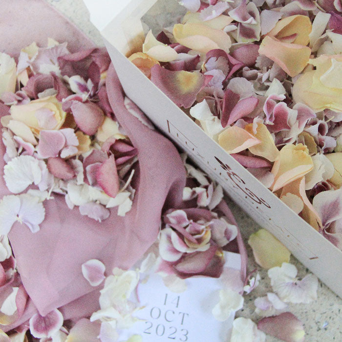
While we don’t offer chartreuse in its most vivid form our sage green hydrangea petals carry that same yellow-green spirit, just with softness and natural variation that only real petals can bring. Scattered together with burgundy, the effect is layered, organic, and beautiful.
Think beyond the confetti moment.
Petals get thought about mostly for that one confetti shot outside the church. But in a palette as rich as this one they can do so much more. Here’s where we’d put them.
- The aisle: A long runner of burgundy petals with scattered sage, minimal, moody, and stunning in wide-angle photos.
- The tablescape: Loose petal scatters among taper candles and dark green foliage. No fuss, no foam, just texture and colour.
- The bridal flat lay: A mix of all three shades around your shoes, perfume, and rings. Those detail shots earn their place in the album.
- The petal bath: Increasingly popular for getting-ready photography. Burgundy and eucalyptus together in a clawfoot tub is an image your photographer will thank you for.
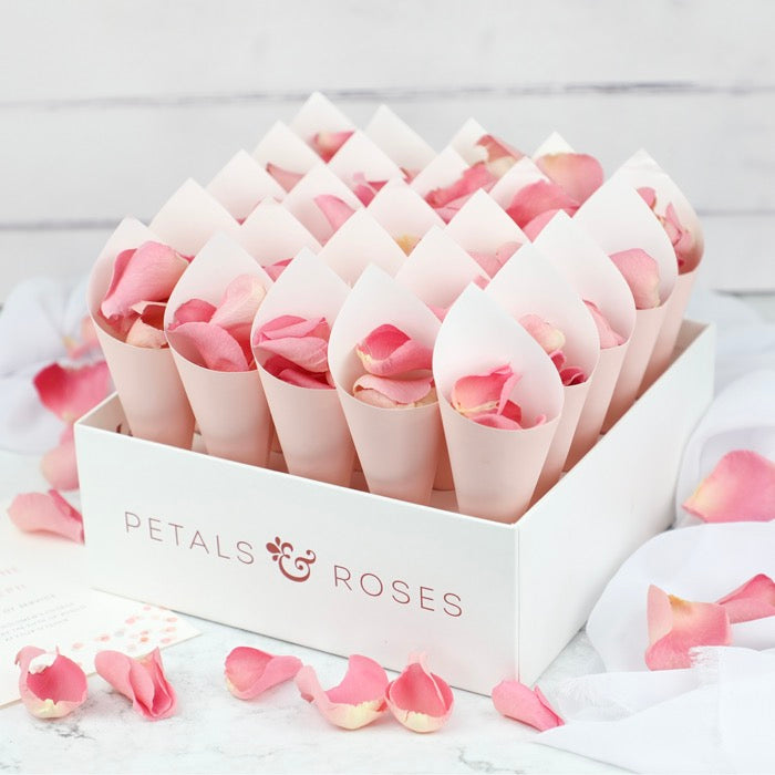
- Confetti cones: Obviously. Mix all three for a throw that looks as good mid-air as it does on the ground.

Which season suits this palette best?
The honest answer is all of them. Just have a different emphasis depending on the time of year.

Getting the balance right.
The one thing to be thoughtful about with this palette is proportion. Because both colours are strong, they need space to breathe. The rule most designers are following this year: one colour dominates (usually burgundy), one punctuates (chartreuse), and a neutral keeps the whole thing from tipping into overwhelming.
With petals that balance is easy to find. You can prioritise different colours through the petals. Use only sage green hydrangea for a pop, only ivory rose petals to ground the rest of the colour in your wedding, or the pick and mix mentioned earlier with a more neutral background to let the petals do the work.